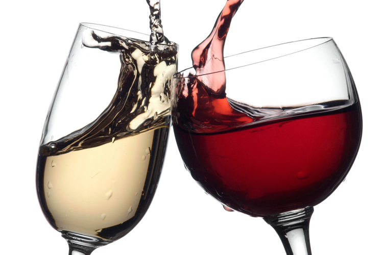
Wine Quality Dataset
Red and White variants of the Portuguese "Vinho Verde" wine
Dashboard Prototype
Currently, I have set up how I want the dashboard to look. I have added the two check boxes for the type of wine, but have not gotten them to work yet. Also, I have implemented the basic Stacked Bar Chart and the Parallel Coordinates with some brushing. The data on the parallel coordinates looks very cluttered which is why I might subset the data a bit. You can find the prototype at the link below.
Dashboard
Dataset Summary
The dataset that I chose to work with is a Wine Quality Dataset. There are 4,898 different variants of wine samples, both red and white, from the North of Portugal. Majority of this data set is columns that reflect the physicochemical elements of the wine. These metrics include the alcohol level, acidity, residual sugar, sulfur dioxides, and many more. There are two categorical columns in this dataset. The first is the quality of the wine, which is on a scale of 0 to 10, and the second is the type of wine, either red or white. More information about the wines were excluded for privacy and logisitic issues. I am hoping that by using this dataset, we can figure out how the physicochemical inputs reflect the quality of the wine. You can find more details on the dataset, here. Depending on how the charts look, I subset the data so that we can see distinctions because there might be too much data on one chart. If that is the case, I will have it so there is closer to an even distribution between quality level.
Sketch Summary
For the sketch of this dataset, I decided to do three distinct charts. The first is going to be a simple stacked bar chart to be able to see the distribution of the quality of wines by wine type, red or white. This will be a very simple chart that will help introduce the data. The second chart will be a scatter plot matrix that will show the relationship between each of the numerical metrics. Ideally, you will be able to choose the metrics that you want to see against each other. The hope for this chart is to see which features are most correlated to each other and reflective of the quality. The last chart will be a parallel coordinates chart where majority of the metrics will be shown and you can brush each one to see specific wines. All three of these charts will be able to be filtered by a check box for the type of wine, red and/or white. You can find more details and the original layout here. I am hoping as I create the different charts, a better layout will result, but for now, I plan to keep them as is.