Wine Quality Dataset
Red and White variants of the Portuguese "Vinho Verde" wine
Planned Tools
If there is data preprocessing required, I plan to use R. Other than that I plan to use D3 for everything else.
Planned Techniques
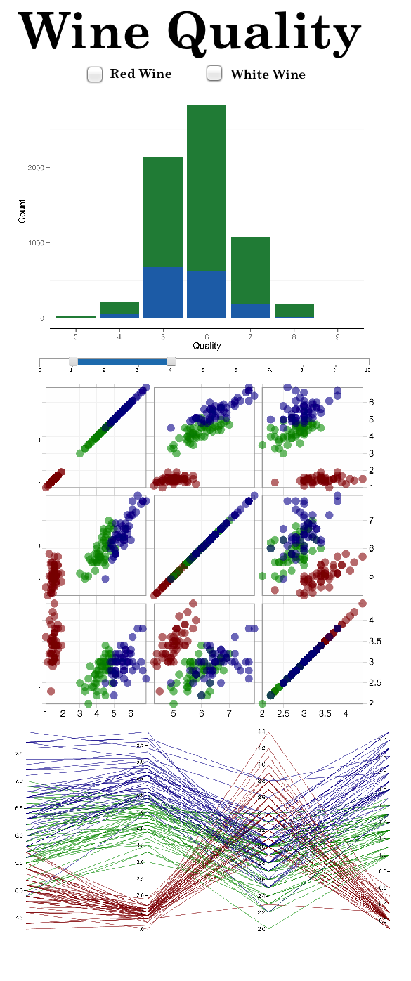
- Bar Chart
- This chart will look at the volume of wines for each quality score and will be a stacked bar chart of both red and white wines
- I am hoping that this chart will show us some skewed distribution of how the wines are classified. If we have a wide variety of wines and an even distribution of quality score, the other metrics (columns) in this dataset will hopefully show us why some wines have a lower/higher quality score. Also, if we see that white/red wines are skewed towards one end of the distribution we will be able to look at what factors of the wine are affecting the score.
- Scatter Plot Matrix
- This chart will show relationships between the majority of the columns (fixed acidity, voatile acidity, citric acid, residual sugar, etc). It will also be colored by either quality score or type of wine (depending what the user chooses)
- From this chart, we should be able to see some relationships between the different attributes of wine. Hopefully, this will give us some idea for which attributes are highly correlated and hopefully reflect in the quality scores or in the type of wine. Also, being able to choose which metrics we want to see side by side is an option that I am hoping to implement. This way we can see the metrics that we want to see and exclude those that we do not.
- Parallel Coordinates
- This chart will show the general trends for each quality score. The first axis will have the quality score and the rest will be attributes like the one listed above. The colors for this chart will indicate the type of wine.
- With this chart, I am hoping we can see trends of the types of wines for each quality score. Like the scatter plot matrix, I think it will help us to see relationships between our attributes and be able to show the difference between our white and red wines.
Planned Interaction
- For all Charts
- Filtering
- Type
- Being able to only look at just red or white wine
- Have check boxes to be able to filter
- Bar Chart
- No Additional Interactions
- Scatter Plot Matrix
- Filtering
- Quality
- Choose the range of quality scores that we want to see and only show points with those values
- This will be a slider where you can choose the min and max of your range from 0 to 12
- Attributes
- Being able to select only the attributes that you want to see
- Have check boxes for each of the attributes
- Brushing
- Being able to brush over a specfic set of points
- This will grey out the rest of them, and show just those points on each of the other plots
- Change Color
- Being able to choose whether the colors are for the type of wine or the quality of wine
- This will be a button/check box to select which one you want to see (or None)
- Parallel Coordinates
- Brushing
- Being able to brush over specific points on an axis to show only those lines
- This wil grey out the rest of the lines and show just those selected throughout the whole plot
Planned Interface